Fund Transfers
2025

Context
Raiffeisenbank is a universal bank in Russia, a subsidiary of the Austrian banking group Raiffeisen Bank International. It is listed among the systemically important Russian banks.
Since 2013, Raiffeisenbank has been working with entrepreneurs. 99% of services for entrepreneurial clients are available entirely online through the Raiffeisen Business internet banking or mobile app.
In 2025, Raiffeisen Business's main focus is on developing and improving transactional operations. These include all types of transfers and the core scenarios from which the bank earns commissions.
-
Project Type
B2B
-
Project Timeline
2 months
-
My Role
Senior UX Designer
-
Project Stack
Figma, Notion, Miro
Limitations and metrics
Work is limited to the current user base. There are also legislative restrictions regarding the necessary fields in payment orders (Order of the Ministry of Finance of the Russian Federation No. 107n dated 12.11.2013).
For transfer-related flows – reducing session time (the user should fill out fields faster and move to the payment stage quicker) and reducing churn rate. For service-related flows – improving the funnel for service sign-ups.
Usability testing
Since the task focused on improving the current functionality, the main research method used was usability testing. On a test account, we walked through 16 scenarios and corner cases with respondents, during which they made transfers and activated services. A total of 23 users were involved in studying the current issues in the interface. We collected qualitative data, which was later verified through analytics and customer support requests.
How did we evaluate problematic scenarios?
We used our own standard, which has proven to be reliable and has been tested in several hundred usability tests
We classify all decision points of a scenario into: primary, secondary, and additional. The primary scenario is the one that the user came to complete, the core purpose of the flow. All respondents must pass this scenario without errors.
Percentage of users who did not pass
0 %Secondary scenarios are variations of the primary scenario that occur in no more than 35% of the overall user actions.
Percentage of users who did not pass
30 %Additional scenarios refer to rare cases or minor issues discovered during testing, such as fields not being clearly highlighted. While these issues did not prevent users from completing the scenario, they were noted as potential improvements.
Percentage of users who did not pass
60 %Problems and solutions


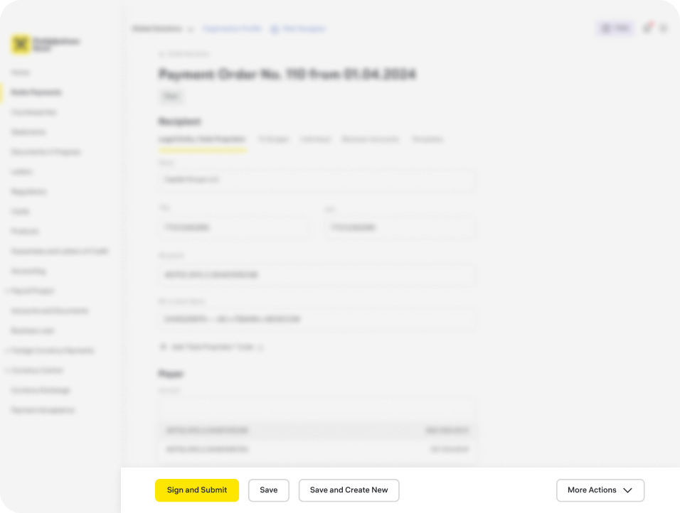
Payment Order Layout
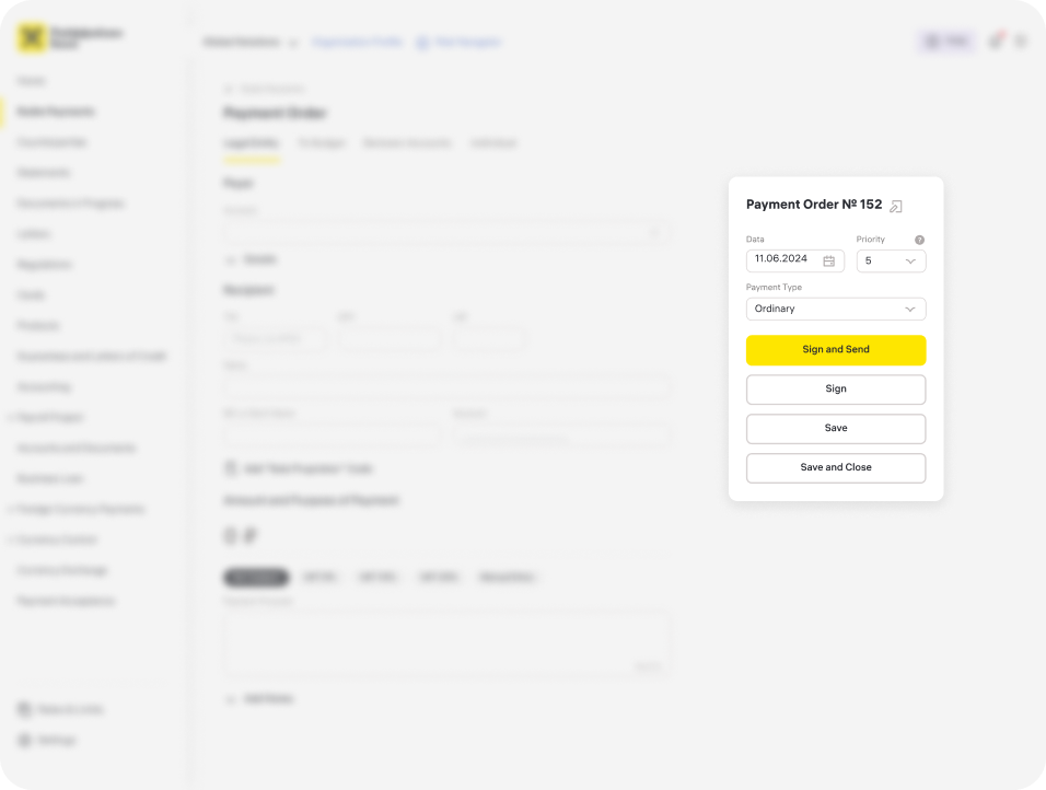
We started by testing the core scenario in the bank, which is payment orders. We had two layout options for the payment order. The first was the classic layout, similar to the form used by the Ministry of Finance of Russia. The second was redesigned for digital surfaces.
The main difference between the two is that the first payment order is horizontal, and most of the information fits on one screen. For this reason, the signature block is moved to a separate menu on the right. The second payment order is vertical, with each field placed on a separate line, and the signature buttons located at the bottom of the form.
The hypothesis was that the vertical layout would be easier to fill out without scrolling. Spoiler: the hypothesis didn’t hold true.
How did we test it?
We assessed the speed of filling out both payment order layouts, asking participants to fill in all fields, even less common ones, with the most important task being to make changes to a previously filled-in form. The winner was determined based on the results of the last task.


Both layouts performed similarly when it came to filling out the fields. The horizontal layout had issues with the right-side menu; participants could see the buttons but not the fields above them.
The most critical issue, however, was that users struggled to find fields for editing. This was because in some rows, we had two or even three fields to fill in, making them hard to find.
Participants were able to locate the correct row in the vertical payment order in about 5 seconds, while it took 12 seconds in the horizontal layout. Scrolling didn’t affect the filling speed but had a significant impact on verifying the fields. This is crucial since, according to our data, 90% of users check the details of a payment order before submitting, even if they loaded it from accounting software.
According to the Ministry of Finance of Russia’s Order No. 107n, dated 12.11.2013, a payment order must contain 39 fields for filling out. However, there is no requirement to maintain the layout used in paper versions, which is why we opted for vertical payment orders.
1C Import
One of the most popular scenarios in the online banking system is importing payment orders from accounting software.
are filled correctly
order is detected. Essentially, we can only show one error:
that the payment order has already been uploaded
by the user.
number or TIN

- "Uploaded" state means all fields are filled correctly
- "Uploaded with errors" occurs when a duplicate payment order is detected. Essentially, we can only show one error:
that the payment order has already been uploaded by the user. - "Not uploaded" occurs when there are errors in the account number or TIN

We upload the payment order, highlight the duplicated fields, and display an alert indicating which fields are duplicated from an existing payment order. However, users didn’t really appreciate this feature. They either ignored the alert or thought that the fields contained errors in the data. In tests, 15 out of 23 respondents said they frequently saw this warning in their bank but didn’t understand what they were doing wrong. Analytics confirmed that over 40% of users regularly upload duplicate payment orders.
Since we show the duplicate payment order, any change in the fields will make the payment order valid again because it is no longer a duplicate—it contains changes. For example, when four fields are marked in red, just changing the amount will stop all fields from being red. But users don’t understand this.

We spent a lot of time considering how to improve this flow and tested several concepts. Eventually, we came up with the following solution:
- We removed the diagram that users did not understand. Now, we immediately show a list of payment orders, and users can switch between the loading statuses using tabs

- We upload the duplicate payment order without showing any errors. When the duplicate is opened, we gently notify the user that this payment order already exists and give them two options: either save both payment orders or delete the duplicate. According to our research, users simply forgot that they had already imported this payment order and that it was waiting for approval. A simple duplicate message covered 72% of the cases where users uploaded a copy.
If the user decides to keep both payment orders, both will appear in the "Payments" section with the status "Waiting for Signature" until they are paid or deleted.


Services and Products
In this project, we also focused on the integration and first use of the bank's services, as these also generate transaction commissions for us.
In the online banking system, there is a section called "Products," dedicated to all our services. Once one of these services is connected, a corresponding section appears in the menu. However, during testing, we realized that users couldn’t find the new section and instead kept going back to the "Products" section to access the connected service. We confirmed this observation through quantitative data and redesigned this section.

The detailed separation of products also didn’t work as expected. Initially, the section had separate fields for connecting services such as payment processing, online cash registers, and payments via merchant stickers. During the research, we found that entrepreneurs struggled to navigate these terms and make quick decisions on which section to enter.
So, we changed the positioning of the section. Now, it serves as an entry point not only for connecting new services but also for accessing existing ones. We also combined several services into a single card and, during the form completion process, we offer the user the most suitable option based on their needs.
Results
The new designs were tested through usability testing (3 iterations for each flow, with a total of 37 respondents) and, after the changes, were rolled out to a test group for A/B testing.
As expected, the most impressive results came from the improvements in importing from accounting software. We were able to eliminate duplicate payment orders in over 70% of cases without increasing the time it took to fill out the payment orders. By converting all payment orders to a vertical format, we reduced the filling time by 15% compared to the previous horizontal format, which met our original goal.
Additionally, for single payments after import, we suggested allowing immediate payment rather than just saving them to the payment list. In the A/B test with a group of 4,000 users, these changes resulted in an incredible 24% increase in the number of transactions. This was a record high for the TRX metric.
Moreover, by redesigning the "Products" section, we were able to reduce contact center inquiries related to services. They now rank 15th out of 17 total inquiry categories, compared to 9th initially. This change resulted in a 27% decrease in customer support inquiries related to services.