Visual Display Unit
2023


Context
KFC Corporation, operating under the brand name Kentucky Fried Chicken (KFC), is an American fast food restaurant chain headquartered in Louisville, Kentucky. The company specializes in fried chicken and is the world's second-largest restaurant chain by sales, following McDonald's. As of December 2019, KFC operates 22,621 locations in 150 countries. The chain is a subsidiary of Yum! Brands, a global restaurant company that also owns the Pizza Hut and Taco Bell brands.
-
Project Type
Staff Tools
-
Project Timeline
4 months
-
My Role
Senior UX Designer
-
Project Stack
Figma, Notion, Miro
Metrics
The primary metrics focus on increasing order assembly speed and minimizing errors in order processing.

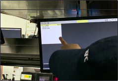
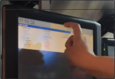
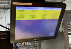
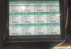
VDU screens are displays located above the tables in each kitchen workstation. They show all the key information about orders: what’s included, the current stage of readiness, and which workstation is handling the order. Employees also use these screens to assemble orders for pickup.
Our team got the chance to redesign the default R-Keeper interface. We spent four months studying how staff use the VDU screens in their daily work. During this time, we spotted all the key issues in the workflow and came up with practical solutions to fix them.
This was a complex challenge. We encountered several issues, including technical limitations, staff habits, and the physical placement of screens in the restaurants. To gain a clear understanding, we visited 16 restaurants with various setups, including drive-thru, express, and food court formats. We interviewed cooks and managers, spending two weeks observing how everything operated. During this process, we gathered statistical data and collected feedback from the staff.
Problems and solutions
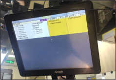
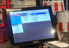
The ergonomics and equipment in restaurants vary a lot. Sometimes the screens are mounted too high or too far from the workspace. To make things work, cooks often enlarge the image in the settings, but the screens aren’t designed for scaling, so parts of the order cards end up cut off. To fix this, we developed three scaling options for the order cards. Now employees can adjust them to their needs without worrying about distorted or missing information.


Many features of the information display are hard for new employees to understand intuitively, which makes training take longer. For example, in the order card, an asterisk at the beginning of the text means the dish should be spicy, while at the end it indicates the number of pieces. New employees need time to get used to this system. With the high staff turnover in the kitchen, employee mistakes become a serious problem, leading to financial losses for the company.
Employee errors caused by poor design are absolutely unacceptable. To fix this, we created a clear “spicy” icon that everyone can understand at a glance. We also removed the asterisk as a symbol for quantity and replaced it with a more intuitive label: “piece.”
Manager: “It means the dish is spicy.”
Me: “How do the staff know that?”
Manager: “They just have to remember. At first, they forget and make a lot of mistakes. That’s how they learn.”

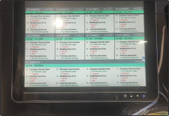
During our research, we discovered that the screens have a limit on the number of dishes they can display per order. For example, if an order has 20 items, only 15 are visible on the screen. The worst part is that the cook won’t even realize there are more items in the order until they start preparing it. This leads to missed dishes, frustrated customers, and slower staff performance.


We designed a flexible order card that expands to fit any size order. If needed, a large order can take up the entire screen.

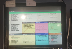
The font style was all over the place. Some dishes were written in capital letters, some in bold. Adding or removing ingredients was indicated by the words “Remove” and “Add.” The font wasn’t designed to scale, so when the screen was enlarged, the text became almost impossible to read.

Electronic check icon
Bold for combo name, regular for content
Icons for adding and removing ingredients
Spicy icon
A line after each set to separate it from the next dish
We replaced the font with Roboto Flex and customized the weight to ensure it scales properly without losing readability. We also created a clear information hierarchy: main courses are now highlighted in bold, while their ingredients are shown in regular font. Instead of using the words “Remove” and “Add,” we introduced icons. They’re much faster to read, save cooks time, and take up less space on the order card.
- delivery
- dine-in order
- drive-thru order
- takeout order
- third-party order
When designing a service for staff, we need to be very careful with visual changes. Employees rely heavily on color codes, and changing them could create chaos in the kitchen.
- delivery
- dine-in order
- drive-thru order
- takeout order
- third-party order
Instead of changing the colors, we adapted them. We made the colors less saturated to ensure they display correctly on different screens.
Results


We spent a few days testing layouts on different screen qualities in the office and a few more weeks doing field tests with employees. This helped us fine-tune the font colors and sizes as accurately as possible. We’re now gradually rolling out the updated design to restaurants, but we already have some early results. Errors in large orders have dropped by 16%, and mistakes in the spicy/non-spicy category are down by 18%.